
- Sku: 6639
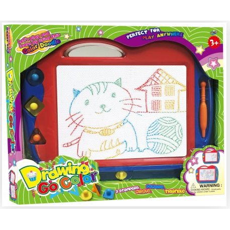
Drawing Color Board
Drawing Color Board
The Drawing Color Board is a focused, reusable surface that brings color theory and creative planning to life. Designed for artists, students, and hobbyists, it offers a dedicated space to test hues, explore saturation, and sketch compositions before committing to final artwork. If you’ve ever felt color decisions slow you down, this board streamlines your process by keeping color exploration organized, visible, and repeatable.
Why this color-focused board matters
Unlike traditional sketchbooks, the Drawing Color Board centralizes color testing in one accessible area. You’ll be able to compare tones side by side, remember successful palettes, and refine choices faster. It’s not just about drawing—it’s a practical tool for developing your eye for color, balance, and contrast. With a defined swatch zone and clear labeling, you can see how warm and cool hues play together, how values shift across light to shadow, and how a mood shifts with each hue tweak.
Key features that set it apart
- Defined color test area: A dedicated space to swatch and compare colors, making it easy to spot to-die-for combinations and avoid muddy mixtures.
- Clear organization and labeling: Color codes and labels help you reproduce palettes later, ensuring consistency across studies, sketches, and final pieces.
- Palette testing and mood mapping: Pair warm and cool hues, map values from light to dark, and document tonal relationships for depth and atmosphere.
- Compact, portable design: Lightweight enough for travel, classroom sessions, or a compact home studio setup, so color planning fits into any workflow.
- Media-friendly surface: Works with pencils, markers, and paints, enabling fluid exploration across drawing and painting practices.
Who should use the Drawing Color Board
Whether you’re just learning color theory or you’re a seasoned creator mapping out a large project, this board is for you. It’s especially helpful for:
- Art students tackling color wheels, harmonies, and tonal values
- Illustrators outlining palettes for characters, scenes, or product concepts
- Design enthusiasts refining mood boards and cohesive color schemes
- DIY artists seeking a repeatable process for color-driven sketches
Practical use cases
- Test and compare multiple color combinations side by side before committing to a full piece, preserving precious materials and time.
- Draft quick color thumbnails to establish lighting, mood, and atmosphere for a scene.
- Organize palettes for a series of illustrations or branding assets to maintain visual consistency.
- Annotate color notes and experiment with foreground, midground, and background hues to plan depth and contrast.
Tips to maximize your Drawing Color Board
- Start with a simple color test row: Log which hues you like together and why, then reuse that palette in future sketches.
- Pair with a shade map: Label lightest to darkest areas to visualize value changes at a glance.
- Make it part of your warm-up: Use 10–15 minutes on color exploration before tackling complex pieces to sharpen color judgment.
- Integrate into study routines: Combine quick color exploration with your regular practice to build a repeatable workflow.
Design philosophy and value
The Drawing Color Board centers clarity, repeatability, and hands-on color exploration. By consolidating testing, planning, and note-taking in one surface, it reduces decision fatigue and supports a more intentional creative process. You’ll gain a tangible system for tracking what works, revisiting successful palettes, and reproducing consistent results across multiple pieces or projects.
What you can expect in use
Over time, you’ll build a personal library of reliable color combinations, understand how hue temperature affects composition, and cultivate a faster, more confident approach to color decisions. The board isn’t just a testing ground—it’s a practical studio companion that grows with your projects, from quick sketches to multi-piece campaigns.
Drawing Color Board
The Drawing Color Board is a focused, reusable surface that brings color theory and creative planning to life. Designed for artists, students, and hobbyists, it provides a dedicated space to test hues, experiment with saturation, and sketch compositions before committing to final artwork.
Why choose a color-focused board over a traditional sketchbook? It keeps color exploration organized and visible, helping you compare tones side by side, remember successful palettes, and refine your color decisions faster. This isn’t just about drawing—it’s a practical tool for developing your eye for color, balance, and contrast.
- Color testing made simple: A defined area to swatch and compare colors, so you can pair warm and cool hues with confidence.
- Efficient planning: Capture quick thumbnails, layout ideas, and palette choices in one place before you commit to a final piece.
- Portable and versatile: Lightweight enough for travel, classroom sessions, or a compact home studio setup.
- Supports a range of tools: Works with a variety of drawing media, from pencils and markers to paints, enabling seamless creative exploration.
- Clear organization: Color codes, labels, and an intuitive layout help you track progress and reproduce successful combinations later.
Who this is for
Whether you’re a beginner learning color theory, a student preparing study notes, or a seasoned creator mapping out a large project, the Drawing Color Board gives you a dedicated canvas to experiment, compare, and plan. It’s particularly useful for:
- Art students tackling color wheels, harmonies, and tonal values
- Illustrators outlining palettes for characters, scenes, or product concepts
- Design enthusiasts refining mood boards and color schemes
- DIY artists seeking a repeatable process for color-driven sketches
Use cases and practical scenarios
Use the board to:
- Test and compare multiple color combinations side by side before committing to a full piece.
- Draft quick color thumbnails to establish lighting, mood, and atmosphere for a scene.
- Organize palettes for a series of illustrations or branding assets to ensure consistency.
- Annotate color notes and experiment with foreground, midground, and background hues to plan depth and contrast.
Practical tips to get the most from your Drawing Color Board
- Start with a simple color test row—log which hues you like together and why, then reuse that palette in future sketches.
- Pair the board with a quick shade map: label lightest to darkest areas to visualize value changes at a glance.
- Use it as a warm-up tool before you tackle more complex pieces to loosen up and sharpen color judgment.
- Integrate it into study routines: dedicate 10–15 minutes to color exploration side-by-side with your regular practice.
Design philosophy and value
The Drawing Color Board emphasizes clarity, repeatability, and hands-on color exploration. By consolidating testing, planning, and note-taking in one surface, it reduces decision fatigue and supports a more intentional creative process. It’s a practical upgrade for anyone who wants to move beyond instinctual color choices toward thoughtful, repeatable color strategies that elevate their artwork.
Where it fits in your workflow
In a busy studio or classroom, this board acts as a central hub for color decisions. Draft fast thumbnails, lock in palettes for a whole project, and keep your final artwork consistent across sessions. When you’re ready to translate color decisions to your canvas, the Drawing Color Board serves as a reliable reference that travels with you—from desk to studio, classroom to field.
Drawing Color Board